Foundations of Color Coordination with Fleece Throw Blankets
Analyzing Your Room’s Existing Palette: Walls, Flooring, and Key Furniture
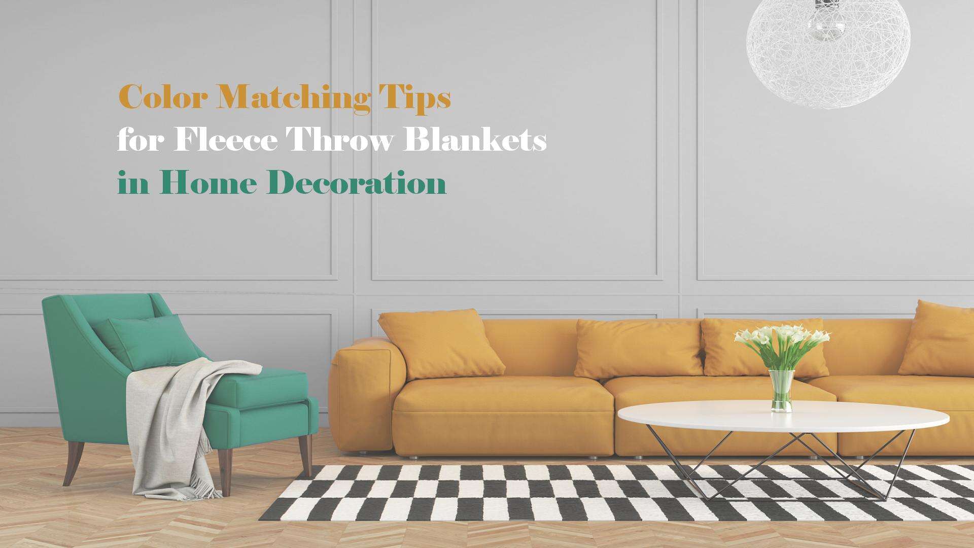
Before picking out a fleece throw blanket, take a good look at what colors already dominate your space. Check out the walls, floor material, and big furniture items to get a sense of the main colors and their undertones. Warm oak floors paired with beige walls usually point toward earthy neutral tones, whereas gray marble tends to create cooler vibes. Write down these observations to build your basic color scheme. Most interior designers would agree that keeping similar undertones throughout a room works best. For rooms with cool tones, try adding a throw in rich jewel colors like sapphire blue or deep purple. Warm spaces look great with accents of terracotta, rusty reds, or even mustard yellow. Taking this time to analyze your existing colors helps avoid clashes and makes sure the blanket complements everything else instead of standing out too much.
Applying the 60-30-10 Rule to Fleece Throw Blanket Placement
The 60-30-10 rule works great when placing a cozy fleece throw around the house. Think about putting most of what's in the room (about 60%) on big stuff like sofas and walls first. Then maybe 30% goes toward things like curtains or rugs, and save that last 10% for special touches where the throw itself fits right in. Try draping one over an armchair that's all neutral colors, or toss it diagonally across a bed covered in matching sheets if the bedroom looks too boring. Want to make sure it stands out? Pick a throw color that doesn't match whatever makes up those middle 30%. Teal really pops against sage green furniture, for instance. Following this method brings some warmth into any space while keeping everything from looking cluttered beyond belief.
Seasonal Fleece Throw Blanket Color Strategies
Spring & Summer: Light Neutrals, Soft Pastels, and Breathable Contrasts
When summer rolls around, going with lighter neutral tones such as ivory, misty gray, or soft oatmeal helps keep spaces feeling bright and open. These colors let sunlight bounce around naturally without making rooms feel cramped. For those who want a pop of color without overwhelming the space, pastel shades work wonders. Think lavender, seafoam green, or even a subtle blush tone can bring life into a room without adding bulk. Throw in some linen pillows and botanical prints on walls or furniture pieces to really drive home that fresh summer vibe. And don't forget about comfort factors too. Lightweight fleece works great during hot spells and goes surprisingly well with natural elements like rattan furniture or wooden accents that aren't too dark. The combination makes for both practical living and aesthetically pleasing surroundings when temperatures climb.
Fall & Winter: Earth Tones, Deep Jewel Tones, and Layered Texture Pairings
As the weather gets colder, it makes sense to bring in those warm, earthy colors. Think about terracotta, olive green, maybe some burnt sienna on walls or furniture. Jewel tones work great too - emerald green, sapphire blue, even plum purple can really stand out. These darker shades go beautifully with things like leather couches, wood tables with walnut finish, and those modern matte black light fixtures people love so much these days. Want to make a room feel cozier? Throw a thick fleece blanket over the back of the sofa and pile on some chunky knit cushions. A few faux fur pieces here and there add that extra touch of luxury. The deeper colors help ground a space, creating a sense of warmth when daylight starts getting scarce and the nights draw in.
Neutral vs. Bold Fleece Throw Blanket Styling Approaches
Neutral Fleece Throw Blankets as Anchors: Linen, Oatmeal, and Charcoal
Fleece throws in neutral shades like linen, oatmeal, charcoal, or heather gray work wonders as texture bases for any room. These colors bring together all sorts of patterns and materials without stealing the spotlight, which makes them great for busy areas or rooms that get used for different things throughout the day. According to a recent survey from the Home Textiles Association, around two thirds of professional decorators turn to neutral tones when dealing with complicated color combinations. Try draping an oatmeal colored throw over a beige couch to create deeper tonal relationships, or place a charcoal one atop lighter bedding for subtle contrast effects. What's really nice about these neutral options is how easy they are to update seasonally just by changing out a few accent pillows here and there.
Bold Fleece Throw Blankets as Focal Points: Vibrant Accents Without Overwhelm
Bright throws in colors like emerald green, deep red, rich blue, or tangerine orange bring real energy to spaces when placed thoughtfully. Stick to just one per room so things don't get too busy, and pair these bold hues with something neutral behind them. Think navy blanket on a cream couch for instance. Patterns that are geometric shapes or have subtle color shifts work great because they catch the eye but still fit together nicely. Studies about how colors affect our feelings suggest that adding these vibrant touches can make rooms feel warmer by around 40% during winter months, which is why they're practical as well as pretty. For maximum effect, fold the throw neatly over a chair back for a clean look, or let it spill off the edge of a sofa where it adds softness and makes people want to reach out and touch it.
Practical Styling Tips to Maximize Visual Impact of Your Fleece Throw Blanket
Elevate your fleece throw from accessory to design asset with these four proven techniques:
- Casual Drape: Toss loosely over sofa arms or chair backs–showcasing plushness while preserving relaxed elegance
- Structured Fold: Fold neatly into thirds and place at the foot of beds or across ottomans for clean, tailored sophistication
- Waterfall Cascade: Dangle diagonally from furniture edges to introduce fluid movement and soft visual rhythm
- Layered Composition: Combine with contrasting textures–linen pillows, jute rugs, or ceramic accents–to build dimensional depth
Place those cozy throws somewhere they can catch some good light from windows, next to reading lamps, or even beneath those pretty pendant lights we all love so much. Change things up with the seasons too. Summer calls for neat folds and clean lines that match our minimalist vibes, while winter is perfect for those soft, flowing drapes that really bring out the hygge factor. When adding something bold to a room, it helps to put it against walls or furniture that are more neutral colors. This keeps everything looking balanced without trying too hard. The actual textures, colors, and how we arrange them will naturally draw attention where it matters most.
Frequently Asked Questions (FAQ)
What colors work best for fleece throw blankets in cool-toned rooms?
In cool-toned rooms, rich jewel colors like sapphire blue or deep purple are excellent choices for fleece throw blankets.
How can I make a bold-colored fleece throw blanket stand out?
To make a bold-colored fleece throw blanket stand out, pair it with neutral colors in the backdrop and stick to just one bold throw per room.
What are the recommended styles for arranging fleece throw blankets?
Some recommended styles for arranging fleece throw blankets include the casual drape, structured fold, waterfall cascade, and layered composition.
How do fleece throw blankets affect room warmth perception?
Add vibrant-colored throws to a room to enhance warmth perception significantly, even increasing the feel of warmth by around 40% during colder months.